7 Reasons

Tag: PICTURE

  • 7 Reasons That I’ve Been Baffled By A Doormat

    7 Reasons That I’ve Been Baffled By A Doormat

    Okay, I’ve been really confused.  I’ve had a tricky problem that’s been plaguing me for the past two days that I think I’ve finally solved but it’s been quite a journey.  It all started with a new arrival*.  A doormat.  I bought it to go inside the front door in the 3’ x 3’ space that, if I were grand, I’d refer to as my entrance hall or vestibule.  As it is, I’ve really never referred to that space before, I just know it as the-area-behind-the-front-door or occasionally the-area-in-front-of-the-world.  Anyway, I digress.  Below these words and above some more is a picture of the doormat.  Here are seven reasons that it’s been baffling me.


    1.  Perspective.  Yesterday morning, I pulled the mat from its bag and strode to the front door.  I had blithely supposed that I would be able to place the doormat inside the door and walk away to do something else.  Something important.  Something interesting.  But as I went to place the mat on the floor I felt troubled.  The problem was that the mat has a picture on it.  That means that it’s no mere utilitarian home accessory.  It’s also art.  Not high-art, admittedly.  It’s not Da Vinci’s Mona Lisa or Klimpt’s Portrait of Adele Bloch-Bauer I, which is fortunate as they probably wouldn’t fare well hanging on the floor in my hallway, and I would probably soon tire of the tourists.  But it’s still art.  And art’s there to be contemplated and enjoyed, to enhance an environment and provide stimulation for those that inhabit the same space.  Essentially, in this case, I realised that when I looked at the owls, I wanted them not to be upside down.

    2.  But That Would Be Unwelcoming.  Surely the doormat should face outward.  To welcome guests.  To make a nice first impression.  What would we be saying by having the mat face inward?  That we’re selfish people that want the owls the right way up for ourselves and care not a whit for the feelings of others?  That would make us appear distinctly unwelcoming.  You can’t greet people with upside down owls.  It’s a question of doormat etiquette.  Doormatiquette.

    3.  But!  Does an outward facing mat welcome guests though?  Because when the guests come into the house – and they sometimes do, we’re sociable people that don’t bite – the owls would be upside down.  So then everybody would be looking at the owls the wrong way up.  Both guests and residents.  No one would win.

    4.  Furthermore!  Having an outward facing mat would send another message.  An unwelcoming message.  And that message is Stop!  Come no further.  Being in the house is an anti climax.  Beyond this point, the owls are upside down.  If you stay outside it’s better.  These people have put this thing here to make sure you stand on their doorstep and come no further.  I was beginning to realise that placing a doormat was more complicated than I thought it was going to be.

    5.  A Compromise?  Okay, so there was no way I could have the doormat facing inward or outward.  But could I compromise?  Turning the doormat sideways would seem to be a fair thing to do, but wait?!  A sideways doormat!  That would be weird.  If someone opened a front door to you and their doormat was sideways you’d think they were barmy.  You’d assume that they were a gibbering harebrain that spent their nights pointing at the moon and their days pointing at the space the moon had been the previous night, pausing only to laugh hysterically at bicycles.  Have you ever been in the house of anyone with a sideways doormat?  No.  Of course not.  People that have been in the houses of people with sideways doormats are probably still there tied down in the cellar or imprisoned in the shed, being forced to eat balloons and comb a jelly or some equally bizarre and hideous fate.  The sideways doormat compromise was out.

    6.  Brainstorming.  By this point, I realised I needed help**.  I decided to ask Twitter.  Carrying the doormat over to the computer, I tweeted my dilemma.  With help from @kittyQ, @davidofyork, @kateypotatey, @jonesyinc1 and @amazingzeesh (all lovely tweeters) I brainstormed the problem.  It was difficult and there was no real consensus.  The nearest we got to a solution was @kateypotatey’s idea of hanging the doormat on the wall and putting it down facing outward only when anyone knocked on the door.  But that raised a further problem.  What would we do when the guests came in?  Wait for them to cross the threshold and then hang the doormat up on the wall?  That would make us look odd.  Not sideways-doormat-odd, but still a teensy bit weird.  And if we didn’t hang it back on the wall we’d all be looking at upside down owls again.  Unless I turned the mat to face inward after they came in but that would appear strange too.  And what if more guests arrived while existing guests were there?   What if we had a party?  Should my wife be responsible for making drinks and handing out nibbles while I take charge of rotating the doormat and greeting people?  That doesn’t sound like much of a party to me.  Or a picnic.  The capacity for it all to go horribly wrong would be endless.  I felt dizzy just thinking about it.  I decided to sleep on it.

    7.  And Sleep Helped.  This morning, when I woke I had an idea.  I walked downstairs and turned the doormat upside down.  The doormat would be ostensibly plain and no one would get to see the owls, but I would be able to peek at them whenever I liked.  We’d have secret owls.  But that felt ungenerous and it bothered me for most of the day.  This evening, however, I did solve the problem.  What I need to do is position the mat picture side up, facing outwards, and to convince myself and everyone that comes into the house that it’s a picture of three owls standing on their heads.  I also need to make them forget that I’ve convinced them of that when they leave.  What I need is a live-in hypnotist.  Anyone know one?

    *Cue angry mob.

    **And I sense that many people might agree with me.

  • 7 Reasons That We Shouldn’t See The Photograph

    7 Reasons That We Shouldn’t See The Photograph

    Breaking news:  The world is debating whether or not to look at a photograph, and here at 7 Reasons we have an exclusive.  We have got hold of the picture that you should never, ever see, and we’re going to let you, our thoroughly grown-up readers, decide whether you want to look at it.  The 7 Reasons team have viewed this graphic image and it’s fair to say that we were somewhat taken aback.  In fact there was gasping and a bit of vomiting.  We’re going to post a link to the picture at the bottom of this post but before you go there, let us explain why you shouldn’t look at it.

    a red censored stamp on a black background

    1.  You Don’t Need To See It.  Would your life be improved immeasurably by viewing it?  No. Quite the opposite, in fact.  If you want to look at it, it’s only because of morbid curiosity.  You don’t need to see it, and your life will not be enriched by viewing it.  Trust us on this, we’ve seen it, and once you see the picture, you cannot un-see the picture.  It’s like Pandora’s box except it’s not Pandora’s box, it’s a box belonging to someone else.  Don’t look into the box and certainly don’t zoom in on it with your mouse.  The RSPCA don’t take that sort of thing lightly.  Don’t look into the box!

    2.  It’s Gruesome.  The image is bloody horrible.  It’s truly sickening to behold and it will haunt you until your dying day.  If you don’t want to see something so abhorrent that you might try to poke your own eyes out with a spoon* don’t look at it.

    3.  There’s A ‘Hole.  A big ‘hole.  Where once there was life, now there’s a big gaping ‘hole in the foreground; something vacant.  You really don’t need to see the ‘hole.  Viewing the ‘hole is a truly hideous and traumatic experience that you can well do without.  I would have been better off without ever having seen the ‘hole.  You will be too. Don’t look at the ‘hole.

    4.  It’s Puzzling.  It really is.  Imagine you’re a Viking and a blue cat wearing jeggings is explaining string theory to you.  It’s more confusing than that.  And you don’t get to wear a beard or one of those horny hats either.**  There is nothing in the world that makes less sense than this image***

    5.  It’s Graphic.  We don’t really know the circumstances under which the photograph was taken; perhaps it was hurried, we don’t know, and frankly we don’t want to think about it any further.  But there’s still a fire visible in the background and there’s flesh.  Much flesh. It’s apparent that the scent of burning flesh would have been strong when this picture was taken.  You don’t need to see that or even think about it.  In fact, stop thinking altogether.  It only leads to trouble.  Don’t think and don’t look at the picture.

    6.  Side-Effects.  We’re reasonably young and healthy here at 7 Reasons**** and we felt unwell when we saw it.  So we wondered what this image could do to readers with any underlying health problems and, even though we’re not real doctors, we’ve come to a conclusion via a process of wild speculation and abject conjecture: This image could kill.  And dying would be inconvenient as you’ve probably got things to do this afternoon or dinner plans.   Don’t look at the picture.  And don’t die.

    7.  Trust. Now we’ve put the link to the picture just below this paragraph and we’re going to let you decide whether to look at it or not.  But, before you make that important decision, consider this.  If you look at the image, you’ll be doing it for the wrong reasons as – and we’ve made this quite clear – it’s bloody horrible and you don’t need to see it.  We hope you’ll trust that the judgement of the 7 Reasons team in this matter is sound and that we have your best interests at heart.  So when deciding whether to view it, remember that if you choose to look, you’ll be letting us down and you’ll be letting yourselves down too.  Oh, and you should probably lock away your spoons.


    Here is the link to the image, don’t click on it.


    *Or whatever else you have handy, I don’t know why I assume that all 7 Reasons readers are equipped with a spoon.

    **If we do have a Viking reader, imagine you’re a Norman.  Or a Gerald.

    ***Except for the labels in baby clothes that say “Keep away from fire”.  Where do clothes manufacturers imagine that people store babies?

    ****When the health and age of the team is taken as a mean average.


  • 7 Reasons This Is Clearly Not A UFO

    7 Reasons This Is Clearly Not A UFO

    In the past two weeks Friday has been dedicated to writing about the Cricket World Cup. However, because we wrote about it yesterday – or at least about a dream – we are giving it a miss today. While many of our readers will be disappointed to read this, I ask you to think of our dedicated Polish reader who has no doubt been quite confused as of late. So, instead of cricket, we are going to write about UFOs. A subject that will be close to many people’s hearts if they read last Saturday’s guest post. You may well have heard that yesterday the MOD released 8,500 pages of previously classified information surrounding UFO sightings. Having stayed up all night to read through them I can safely say that some people in this country are officially bonkers. One depiction of a UFO that particularly caught my attention was this one:


    Here are seven reasons that this is not a UFO (and instead probably an entry to some Blue Peter competition) :

    1.  Label. The first giveaway is the label ‘normal corn crop’. May I ask, what other kind is there? An un-normal corn crop? A typical example of someone thinking too much. #Fail

    2.  Arrows. Let’s be honest, we don’t really need arrows to tell us which way up this should go? #Fail

    3.  Saucer. In some respects this is the biggest giveaway. As a rule, if you are drawing a picture of a flying saucer, the last thing you should do is draw around a normal saucer. And that is exactly what this person has done. They’ve got a saucer, turned it upside down and with a pencil drawn around it. #Fail

    4.  Design Features (i). Whenever you are making something up, you’ll generally take something you have seen or heard before and edit it slightly for your purpose. Now, I have never watched South Park, and I am suspecting the person who drew this hadn’t either. Somewhere along the line though we will have seen the character, Kenny. Which is why the weird looking yellow things on the top half of theUFO look just like him. Here’s the proof.

    5.  Design Features (ii). If in doubt, add a few windows. #Fail.

    6.  Design Flaws. The electric fans (possibly doubling up as propellers) on the side of the craft are different sizes. If you look closely you can see that the one on the right is slightly bigger than the one on the left. As a result, if this thing took off – an absurd thought I admit, it would start going round in circles. So not only would it not go anywhere, the alien inside would get dizzy. #Fail

    7.  Huh? I have absolutely no idea what this is supposed to be. The Sun? Mars? A tennis ball? An alien? Another UFO?


  • Russian Roulette Sunday: The Images

    Russian Roulette Sunday: The Images

    Hello!  Happy Sunday! (or Friday, if you’re one of the 7 Reasons team editing this post before scheduling it for Sunday)

    Images are very important to us here at 7 Reasons and we always try to put them together in-house because, though what we post usually isn’t about an image, there’s always at least one picture attached to what we’ve  written.  We wanted to communicate the significance that we place on arresting and original visuals to you, so we decided that today we would chose three each of our favourite images from previous posts (plus one we’d used from Google Images by way of contrast) and hold an earnest and thoughtful contemplation of the importance of imagery in our posts and the technical and aesthetic merits of the selected illustrations as pieces of artwork.  Obviously we failed, so here’s Marc Fearns and Jonathan Lee bickering about pictures instead.

    Hitler’s Hand

    Originally used in 7 Reasons That Size is Important.

    MF.  This is probably my favourite of the images I’ve put together for 7 Reasons.  It’s not technically brilliant (in fact, it’s quite flawed), but boring stuff aside, it ticks all of my boxes: It’s black and white; It has Hitler in it; it has some sort of Photoshop-induced oddity (the big hand), and it has a random, bizarre element to it (the triangle apparently embedded in Himmler’s head).  If it weren’t for Jon’s civilising influence, 7 Reasons would probably look a lot more like World War II than it does already.

    JL. I have a serious problem with this image. It seems to suggest the Nazis were very handy. The Nazis were not very handy. They weren’t even quite handy. The Nazis were rather irritating and quite frankly caused more harm than good. I also have a problem with Himmler. Unlike Marc I am not struck by the triangle in his head, but his the binoculars. Why did Himmler need binoculars? Was he a part time ornithologist? Was he a pervert? Why are they pointing at his trousers? This picture provides more questions than answers. And that I find rather frustrating.

    7 Reasons Playing With A Cuddly Toy 2010 Was Not A Let Down
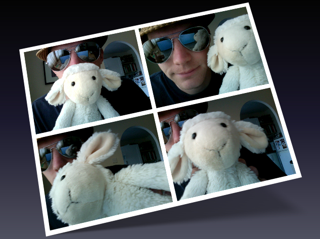
    Lamb & Jon Photoshoot

    Originally used in 7 Reasons Playing With A Cuddly Toy 2010 Was Not A Let Down.

    JL. I like this picture because I look like an idiot. And in this life there just aren’t enough people prepared to be idiots. Sure, there are idiotic people, but that’s by accident. It takes a very special kind of person to deliberately make themselves look like an idiot and I am very proud to say I am very special. It also reminds me of that great day last September with Lamb. Oh, what fun was had. Rock on.

    MF.  I’m less keen on this picture than Jon.  While it does feature a pair of Aviators, which is always a good thing, it’s lacking something quite fundamental.  Hitler.  Or the war generally.  Also, outside of the framing, there barely a straight line in it.  And what’s with the archway?  What sort of oddball has an archway in their house?  And he’s wearing a hat indoors which, as any grandparent would be very keen to point out, is a #manfail.  The only thing that makes this image good is the albino monkey.

    The Anglo-French Flag

    Originally used in 7 Reasons The Anglo-Franco Defence Agreement is a Good Idea

    MF.  This Anglo-French flag is something that I’m rather proud of. I constructed it from a picture of a British flag, a picture of a French flag and a picture of a silk sheet (which is how I got the creased fluttering effect). It wasn’t even in the post itself, it was the featured image, which means that it appears next to the post on menus as a thumbnail and it was in the Latest Posts window at the top of our home page for five days. You might wonder why I’d go to such an effort to create an image that would be barely seen but, to me anyway, that sort of detail is important, and I like to think that 7 Reasons is all the better for having high standards. That the image of the intertwined British and French flags brought Jon to near-apoplexy is purely coincidence.

    JL. As Marc indicates, this picture absolutely disgusts me. I don’t mind the United Kingdom and France joining forces if we are beating up some bad guys, but to merge the Union Jack with the Drapeau Tricolore is nothing less than treason. I have had to ask myself many searching questions since Marc posted this. Should I turn him in? Can I continue to work with him? How the hell did he get that creased fluttering effect? In the end I have allowed Marc to remain living his life in York. The prospect of writing 7 Reasons on a daily basis was just too much to deal with. Rest-assured though, he’s had a warning. A severe one. And, as he’s posted it again, I shall be poking him on facebook too.
    7 Reasons You Should Never Get Cary Grant & Carrie Grant Mixed Up
    Beauty & The Beast

    Originally used in 7 Reasons You Should Never Get Cary Grant & Carrie Grant Mixed Up.

    JL. Let me clarify one thing, I don’t have a ‘Cary Grant dressed as a woman’ fantasy. I think it’s important to remind you of this now as I can see why you may be thinking such a thing. It’s a disturbing sight. I don’t think there is any getting away from that. So why do I love it? Well that comes down to the photoshopping. Do you know how difficult it is finding a picture of Cary Grant and a picture of Carrie Grant that will go together seemlessly? No, of course you don’t. The consequences of your actions rarely lead you to such an investigation. The consequences of starting 7 Reasons very much do. So, yes, I was delighted that I found two pictures that would work together. It’s not perfect. If I had my time again I would do a bit of work on their skin tones, but for the purpose of the post it did the job. And in 7 Reasons circles that means victory.

    MF. For once, I agree with absolutely everything that Jon said about this image.  In his third sentence.  I do, however, have some observations of my own.  Firstly, bloody Twilight: When you’re a vampire and you’re not even the scariest person in the background of a picture, you’re doing it wrong and you should just bloody stop.  Secondly, there’s a terrifying bald man wearing an ill-fitting white suit and eyeliner with someone’s severed arm tucked under his own arm.  I haven’t slept properly since I saw this.  Thirdly, I find Jon’s Cary/Carrie Grant hybrid creature more attractive than the actual Carrie Grant.  Or Cary Grant.  This is troubling.  And Jon never responds to my emails begging him to photoshop more of them.

    Lungs, Heart, Asparagus.

    Originally used in 7 Reasons That We Should Grow Vegetables in our Lungs.

    MF. I put this one together to complement the title of the piece. It’s an original x-ray with the heart and lungs highlighted which I found online and added asparagus to. I’ve chosen this image not just because I’m pleased with the way it turned out, though I am rather. I’ve chosen it because of the almost boundless amusement it gives me every time someone discovers it searching Google Images for x-rays of lungs. I just like knowing that at any given moment someone, somewhere in the world is looking at it thinking, “Blimey! (or perhaps a colloquial equivalent) That looks nasty. I’m going to treat asparagus with more respect now”. I feel certain that one day, this picture will turn up in a medical journal, or on a GP’s surgery wall.

    JL. Who eats asparagus whole? Is that even possible? This is just one of the 7 Reasons images that has inspired readers all over the road. A bit like that man in Norwich who – having been so inspired by a post last June – tried to break the world record for number of Jaffa Cakes eaten in one minute and was subsequently sick all over the biscuit aisle. Now, I am not for a minute encouraging you to see how much whole asparagus you can eat at once – that would be highly irresponsible of us – but if you manage more than five I would love to know.

    7 Reasons To Kiss Properly
    Kiss Kiss, Bang Bang

    Originally used in 7 Reasons You Should Always Kiss Properly.

    JL. I know what you are thinking, ‘Typical Jon. Two of his three image choices feature him.” Yep, I can’t argue with maths. But let’s look at this photo. At least for as long a you feel comfortable doing so. It is an animated GIF! How bloody exciting! But more than that it is a reminder. A reminder of how far my kissing technique has advanced since last March and – if you’ve been using the above as some kind of guide – how far backwards yours has gone. Lovely stuff.

    MF.  “AAAAAAAAAAARRRRRRRRRRRRGGGGGGGGGGGGGGGGGHHHHHHHHH!!!!!!!!!” was my initial reaction to this image when I first saw it eleven months ago.  And now that I am older, wiser and more mature, on reviewing this image I would say that my reaction is now AAAAAAAAAAAAAAAAAAARRRRRRRRRRRGGGGGGGGGGGHHHHHHHHHHH!!!!!!!”.  Note that Jon has attempted to baffle us with maths to distract from the inherent narcissism of his selections, but let’s consider it carefully.  This, as Jon points out, is an animated GIF, so it’s not one picture of him, it’s three pictures of him.  This means that four out of Jon’s five image choices are of himself.  That’s 80%.  Anyway, that aside, I like this picture.  On the first occasion I viewed it I remembered that I was supposed to unblock the kitchen sink, and the repeat viewing has caused me to agree with my wife that I spend too long on the internet and I’ve now closed my laptop, sellotaped it shut and placed it under a sofa.  With an anvil on top.

    Raw Sausages

    Originally used in 7 Reasons That December 24th Should be Known as the Day of the Sausage.

    MF.  Aha!  I remember this piece.  Sadly, I also remember this picture.  It makes me feel sick.  It’s not just that the raw former-animal bits are shiny and greasy looking and some of them appear to be inside used condoms, it’s that I don’t even remember which of us added this to the (co-written) piece.  I realise what must have been going through the mind of the person that uploaded it.  “Sausages!  Sausages!  We’ve written a piece about sausages and now I need an image of sausages – any image of sausages – right now, to go with the piece about sausages!” And, in the grip of a deadline-panic, that person will have just grabbed the first image of sausages that they saw and attached it to the post.  Truly horrible.

    JL. This is a perfect example of what one calls, ‘shooting oneself in the foot’. Not that I shot myself, Marc shot me. And himself. And our argument. Using this image kind of reminds me of that day I sent my CV out to dozens of prospective employers and realised a week later that it didn’t contain my contact details. That section about my ‘outstanding attention to detail’ lost all credibility after that. Now, I’m not saying that the idea of the Day of the Sausage lost credibility with the inclusion of this image, just that – if such a day ever was created – Marc and I would not be part of the marketing team. And that’s sad.

  • 7 Reasons You Shouldn’t Watch The American

    7 Reasons You Shouldn’t Watch The American

    The new Anton Corbijn film – The American – starring George Clooney is out in the UK right now.  I saw it on Saturday, here are seven reasons that you shouldn’t. (and don’t worry, there are no spoilers)

    The poster for the George Clooney, Anton Corbijn, Irina Björklund,Paolo Bonacelli,Thekla Reuten,Violante Placido movie (film), The American

    1.  The Unconcious.  The pace of the first half of The American is slow.  It’s so slow, in fact, that if anyone had said “so slow”, it would have come out as,  “sssssssssssssssssssssssssssooooooooooooooooooooooooo sssssssssssssssssssssssllllllllllllllllllllllllllllllllllllooooooooooooooooooooooowwwwwwwwwwwwwwwwwwwwwwwwww”.   Someone may even have said it, but I’m not sure, as I was dozing.  Not a deep and satisfying slumber, but the fitful sort where you find yourself alternating between brief bouts of consciousness and unconsciousness, with occasional forays into semi-consciousness and thoughts of what the hell is happening to me, is this what old age is like (ness).  So, I’ll sum up what I saw in the first half of the film (without spoilers).  I saw George Clooney living the soporifically mundane daily life of a hit-man.  In a series of slowly cut shots with no dialogue I watched him: Counting his bullets, drilling a series of small holes in some tips, oiling his mechanism (not a euphemism), polishing his barrel (nope, nor this), adjusting his sights, rearranging his small change on a table, lining up his fish fingers in size order, adding up all of the telephone numbers on his mobile and dividing them by four, testing the accuracy of his oven timer against his wristwatch (an Omega Speedmaster Professional with a black dial and black leather strap: model number 3870.50.31, I had time to note), comparing the shapes of his fingernails with his toenails, dusting his light bulbs, and staring into an empty fridge while over his head a strip-light buzzed  (I may be wrong on some of these, but if they weren’t there, it felt like they were).

    2.  The ConsciousThat’s not fair, you’re probably thinking, if you’d been awake, it probably wouldn’t have seemed that dull.  But I wasn’t the only person that was sleeping during the first half.  Because when I was in the toilet after the film, a man standing behind me said, “You were asleep during the first half” and, as I prepared to answer him, the man at the urinal next to me replied, “I know, it was really slow”.  It turned out that they were friends and that I wasn’t being addressed at all.  So there you have it.  Based on the available evidence, there are two distinct types of human-behaviour that occur during the first half of The American.  There are the Sleepers, who sleep, and then there are the Sleeper-Watchers who, while they have remained conscious, aren’t watching the film either; they’re watching people sleep so they can tell them about how they slept later, in great detail; “You kept leaning forward, and then you fell back, and then you leant forward, and then you fell back, and then you leant forward, and then you fell back, and then you said “chopsticks”, and then you fell back…”  was my personal Sleeper-Watcher’s epic account of my movements.  So, during the first half of the film, 50% of the audience are sleeping and the other 50% are watching them sleep and compiling a dossier on their movements, their utterances and their dribbling.  Which means that 100% of the audience are not watching the first part of the film.  That’s how dull it is.

    3.  Lust.  And then the second half of the film begins.  It begins with Violante Placido in bed with no clothes on and, in the words of my personal Sleeper-Watcher, “…you sat bolt upright and stared at the screen while breathing rapidly, remaining in that position for the rest of the scene, before you settled back in your seat and stayed awake for the rest of the film”.  So not only do you get a full report on how weird you are in your sleep, you get a full report on how lecherous you are when you’re wide-awake too.

    4.  Clooney.  And then there’s Clooney. Now I understand that George Clooney’s playing an emotionless, calculating and reserved man.  But we see his bottom in The American, and I can state categorically, that his arse has a greater number of expressions than his face in this film.  Here is his full range of facial expressions in The American (sorry if you were hoping for an arse montage, though we do have one of those on the About Us page):

    A montage of George Clooney's facial expression from the film (movie) The American
    7 Emotions : 1 Face

    5.  References.  During the film, in a scene where Clooney is counting the grains of salt contained in a salt cellar before he thinks about Switzerland for five minutes in a bar with formica tables, something distracting happens in the background.  There’s a film on the television.  It’s Sergio Leone’s Once Upon a Time in the West.  God, I love that film, I thought.  It’s in my top ten films of all time.  Why aren’t I watching that?  Why in God’s name would you taunt the viewer by placing an iconic piece of cinematic brilliance within your own, not  brilliant, movie.  So, he’s made me fall asleep, he’s made me appear lecherous, he’s made me watch a man iron his vast collection of handkerchiefs with a lukewarm spoon, and now Anton Corbijn is actually taunting me.  He’s showing me a bit of a film that I love that’s better than the one he’s made and that I’m watching, I thought.  While screaming inwardly.

    6.  The Pants.  And then there are the pants.  Violante Placido, for reasons I won’t bore you with, decides to disrobe (except for her pants) and go swimming in a river.  But why would anyone take all of their clothes off except for their pants?  Then they’d be wet once they got out of the water.  And they’d have to go home wearing wet pants.  And who wants to wear wet pants for an afternoon?  And I know that you’re thinking that it was for the sake of modesty, but it wasn’t.  Because they became completely transparent the moment they got wet, a fact that my Sleeper-Watcher noted later, before he informed me that I, “…sat bolt-upright and made some sort of involuntary tongue noise.  And didn’t blink for eight whole minutes” in reaction to this scene.  Three days later, after a great deal of thought, I still can’t fathom the pants.

    7.  The Ending.  Again, I won’t tell you what happens, but there’s a moment of awareness when someone alters the thing.  And when that person – whose gender I won’t digress – alters the thing that I won’t name, I had a moment of clarity.  I knew, in that instant, that the character that was going to do the deed would be thwarted by the one that altered the thing and that the other character that I also won’t name would eventually have to do the deed – not with the broken thing that had been altered, but – with another thing but that we hadn’t been introduced to, and that the deed would end badly.  Not only for the character who had been forced to do the deed with the new thing, but also for the character to whom the deed was being done, that countered the deed with his own thing, having previously sparking this chain of events by altering the initial thing in the first place.  And it was just bloody obvious that was going to happen a long time before the end.

    So, to summarise:  During the first half of the film you will fall asleep or resort to watching someone else sleep to keep you entertained; you will then be branded a pervert, be partially baffled by facial expressions, taunted by the director, and then wholly baffled by pants before eventually spotting the blatantly obvious ending many minutes before the film ends.  I don’t think ungoing is an actual thing, but I want to do it.  Right now.

  • 7 Reasons That Postcards Should Be More Honest

    7 Reasons That Postcards Should Be More Honest

    Postcards.  They’re not honest enough.  Here are seven reasons why.

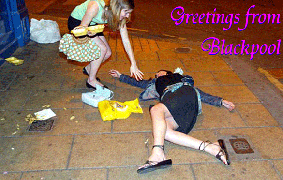
    1.  Blackpool.  This is what a holiday in Blackpool actually looks like.  I’ve been there.  Many times.  Other postcards may not show this, but forewarned is forearmed.

    A picture postcard from Blackpool

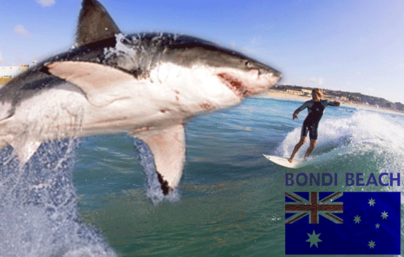
    2.  Bondi Beach.  Sending a postcard from Australia, where it’s nice and warm and sunny you’re having a good time is ostentatious and likely to cause the recipient a pang of envy.  Negate the envy by showing the reality.  That you’re being eaten by a shark.  Or a crocodile.  Or a spider.

    A postcard from Bondi Beach, Sydney,Australia

    3.  Welwyn Garden City.  If the postcard isn’t honest, the recipient might get a false impression of a destination and may choose to visit it themselves.  This would be a mistake.

    A postcard from Welwyn Garden City, Hertfordshire

    4.  Slough! You don’t want to get people’s hopes up about what they can expect as a present.  Unless you show the iconic local product on your postcard, they might expect all sorts of exotica:  A sombrero; a stuffed donkey; a bottle of wine in a wicker basket; an owl.  You need to let them know that they aren’t getting any of these things.

    A postcard from Slough, home of the Mars Bar

    5.  The Natural History Museum.  Or, you can subvert an entire genre of postcards and send this.  That should make the recipient nervous until your return.

    My friends went to the Natural History Museum and all they got me was this louse...

    6.  Yorkshire.  You don’t want the recipient to feel as if they’re missing out on lots of sunshine, warmth and an exotic climate.  Let them know what the weather’s really like where you are.

    A postcard from Yorkshire, England.

    7.  Candour.  Ever wondered why the sender always returns from holiday before the postcard?  Well wonder no more.  It’s because they don’t care enough about you.

    We couldn’t be bothered to write our postcards while we were having a lovely time on holiday so we waited until the last possible moment and did it at the airport.

  • 7 Reasons That The Correct Font is Important

    7 Reasons That The Correct Font is Important

    Fonts: Sometimes we don’t pay enough attention to them, but choosing the correct one is vital for your project; be it a full blown advertising campaign, a sign for your office, a Christmas card or a publicity photo. Here are seven reasons why.

    1.  Playfulness.  Kristen is a lovely, whimsical, childlike font which, when used correctly, imbues the work with a sense of playfulness and naivety.  When used incorrectly however, it is not as effective:

    Adolf Hitler poster with a swastika at Nuremberg saluting (salute) with brownshirts (painting, picture,propaganda). ITC Kristen Font

    The message Drive to the East was intended as a call to invasion and conquest.  This poster may still encourage people to drive East, but now they’ll be doing it in Smart cars whilst drinking Innocent smoothies and listening to Death Cab For Cutie.  The Kristen font is too jaunty for Hitler.

    2.  Menace.  Similarly, Fraktur is a font associated with much Nazi propaganda and many of their legal notices.  When used in this context however, it rather blurs the message:

    a cute bunny picture poster to raise funds for the animal shelter.  Fraktur font

    Even the sad face can’t rescue this one.  The font exudes menace and it makes it appear more of a threat than an appeal:  That if you don’t give them money, ranks of jack-booted stormtroopers will goose-step on poor Flopsy. :’-(  Still quite an effective message though.

    3.  Cool.  Some fonts – Sidewalk in this instance – are rather cool and edgy and, when used sparingly, can really make an impact.

    An office notice about washing up teacups using the sidewalk font

    When making a sign for the office kitchen though, they tend to work less well.  The thoughts of the users of the office kitchen will probably range from, “What in god’s name is that abomination on the wall?!”  to, “Wow!  Emma’s like the coolest person ever to have put up a sniffy notice about washing teacups.  Ever.”

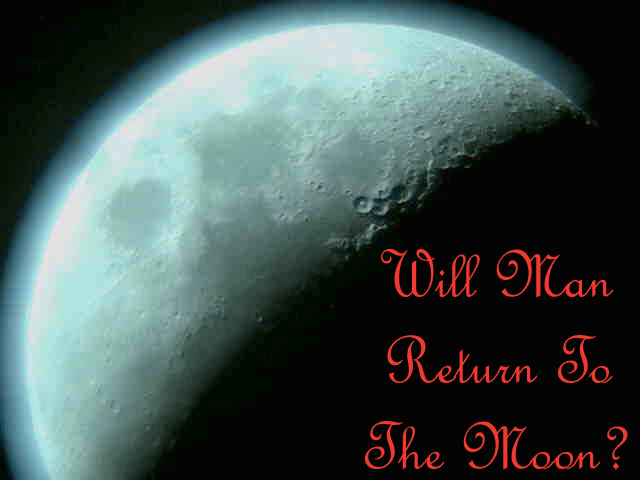
    4. Minimalism.  The moon: A cold, empty, stark place which requires an appropriately minimal font and, when putting together an article on whether man will return to the moon, it’s important to use one.  And not this:

    A picture of the moon and speculation on man's return to it.

    French Script really isn’t doing this picture any favours.  It’s over-elaborate, cluttered, and just not spacey enough.  And it’s French.  They’ve never been to the moon.  They rarely go as far as Sussex.

    5.  Seasonality.  Christmas: Evocative of roaring fires, presents, carol singing, peace, goodwill and happy families spending quality time together at home.

    A Victorian Christmas scene bearing the legend, "Merry Christmas To One And All".  Digital Readout Thick Upright font

    But when your Christmas card features the Digital Readout Thick Upright font, you introduce the spectre of The Terminator into the traditional family Christmas, and that doesn’t seem like it will go well.  Even if he does bring presents from the future.

    6.  Clarity.  Clean crisp fonts such as Gill Sans exude class.  With a plain, unfussy font your carefully chosen words are showcased to their best advantage.  The BBC use Gill Sans, and the famous Volkswagen Lemon advert used a similar font.  Sometimes though, it’s not a good idea to go minimal:

    An extraordinary comment on a Youtube video using a Gill Sans font.

    Because the reader’s attention is drawn to every error and mad utterance in your crazed internet rant.  And yes, I did cut and paste this from a comment on one of our posts.  Answers on a postcard?

    7.  Gasp! There’s a lot of snobbery around the use of MS Comic Sans.  And many perfectly reasonable people say that it should never, ever be used; there are websites and Facebook groups that campaign against it.  But they’re wrong.  Because I’ve found a use for it:

    A black and white (B & W) publicity picture (portrait) of Jonathan Lee. (7 Reasons/7reasons.org).  MS Comic Sans font

    You can use it to take perfectly good, artfully shot publicity photos, and make them funnier.  I’m so happy with this one that I’m not even going to charge for it.  Finally, a use for Comic Sans.

  • 7 Reasons That This Picture Is Amazing

    7 Reasons That This Picture Is Amazing

    A friend of mine sent me this picture.  And it’s amazing.  Here are seven reasons why.

    A cute picture of three pigs (two adults and a piglet) eating.

    1.  It’s Cute.  Just look at the sweet little pig feeding between the bigger pigs.  Look how sweet and little and cute he is.  Awwww.  What a lovely, heart-warming, rustic scene.

    2.  It’s Compelling. The cute pig picture was on my monitor when my wife was walking past the room and, having glimpsed it, she was beside me within a nanosecond, looking rather flustered and seemingly unable to take her eyes off it.  “Isn’t the little piggy cute?”  I enquired.  “Errr…er…yes”, she replied, before wandering off, looking back at it over her shoulder a couple of times as she left the room.

    3.  It’s Unexpected. The friend that sent me the picture of the cute pig did so in an email entitled Not What You Think.  And he was right.  Because usually when I get an email from him it contains some sort of smut or a horrific example of Darwinism.  The last thing I expected was a nice animal picture.  It seems that seeing the cute pig has brought out my friend’s better side.

    4.  It Brings Out Deep-Rooted Primitive Beliefs. Using my phone I showed another friend the picture of the cute piggy while we were in a bar and his reaction was extraordinary.  After a couple of seconds looking at the picture, he grabbed my phone and tried to hide it under the table.  I can only imagine he thought that by looking at the picture we were stealing the pig’s soul, but I never got the chance to ask because…

    5.  It’s Awesome. So awesome that the sight of it caused a woman seated a couple of tables behind us to gasp audibly and point, slack-jawed in our direction.  This was unnerving and we left quite soon after.  But not before I observed that…

    6.  It’s Inspirational.  Because the gasping woman was obviously very taken with the cute piggy; I couldn’t hear what she was saying, but when her friend came back from the toilet she seemed very excited and spent several minutes telling her about the picture in a breathless and animated manner.  She pointed many more times, and touched her ruddy cheeks a lot.  The cuteness of the piggy seemed to have affected her greatly.  Hormones, I expect.

    7.  It’s Baffling. Because I like the cute pig; I like the little fella a lot, don’t get me wrong.  But other people seem extraordinarily taken with him, and there are other, cuter animal pictures out there that don’t provoke such a reaction.  This one, for example:

    a cute picture of baby red pandas in a tree

    Awww.  Much cuter.

  • 7 Reasons That Twitter Should Replace The Fail Whale

    7 Reasons That Twitter Should Replace The Fail Whale

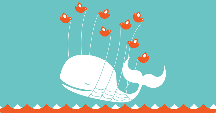
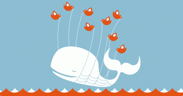
    The Fail Whale. Twitter is over capacity. Please wait a moment and try again. For more information, check out Twitter Status »


    Tharr she blows!  It’s the Fail Whale.  Don’t panic though, dear reader.  This doesn’t mean that our website is down.  We’re just fed up of the Fail Whale, Twitter’s iconic image which surfaces whenever the social media network isn’t functioning.  Beautiful as it is, we think that it’s time to replace it.  Here are seven reasons why.

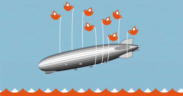
    1.  It’s Not Fair To Whales. Whales have enough problems without Twitter tainting them with failure by association.  Zeppelins, like Twitter, are cool.  Yet they’re already associated with failure.  What better way to show that the network is down?

    The Fail Zeppelin: A more appropriate Twitter screen than the fail whale.


    2.  Sometimes It Appears Erroneously. Sometimes the Fail Whale appears once, only to disappear when you refresh the screen.  This means that Twitter isn’t wholly down, it’s just working slowly.  For that eventuality, they require a Fail Snail.

    The Fail Snail: A Picture to use when Twitter is functioning slowly


    3.  Because Twitter Is Down A Lot. Twitter is a huge success and has grown rapidly.  Yet their servers seem unable to cope.  This constantly frustrates users and, in turn, leads to ill-will towards the network.  If they don’t sort their technical issues out soon, they may find themselves becoming extinct.  The Fail Dodos would remind them of this.

    Twitter's Fail Whale being held aloft by a flock of dodos.


    4.  It Doesn’t Suggest A Helpful Alternative. The Fail Whale doesn’t really tell you much.  This image though, suggests an alternative and more reliable – though archaic – method of communication to use while twitter is down.  Behold, the Fail Mail.

    An alternative method of communication to use when Twitter's Fail Whale appears.


    5.  The Image Suggests Functionality. The Fail Whale image shows a whale being held aloft by Twitter’s cute little birds.  Rather than suggesting that Twitter isn’t working, the Fail Whale image suggests that it is.  A far less plausible, and therefore more accurate, image would be the Fail Bird: A large Twitter bird being kept airborne by school of fail whales.

    A school of Fail Whales carrying the Twitter's bird aloft


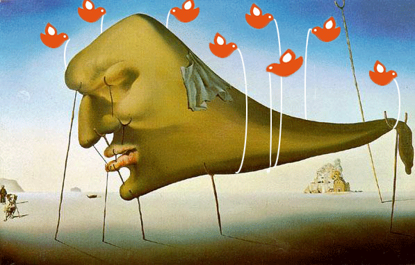
    6. Sleep. Because the Fail Whale image is slightly reminiscent of Dali’s Sleep, which is a much more interesting thing to look at.  And it’s important to be stimulated while you’re unable to communicate with people.

    Salvador Dali's Sleep, as the Twitter logo.


    7.  It Doesn’t Go Far Enough. It’s a pretty picture, but the Fail Whale image doesn’t state what is occurring in clear enough terms.  This is far more descriptive.

    Twitter Fail


    And yes, we did put most of these images together last night, while Twitter was down.


  • Guest(ish) Post: 7 Reasons We Should Be Kept Well Away From Photoshop

    Guest(ish) Post: 7 Reasons We Should Be Kept Well Away From Photoshop

    Today’s guest(ish) post comes to you courtesy of Marc Fearns, who can usually be found doing stuff here, and the amazing Ceci Masters of Swanning About fame; a blog so good that it’s in The Times’ list of the top 50 cricket blogs, along with the blog of another friend of 7 Reasons, Sarah Ansell, and forty-eight other blogs that we’re less interested in.

    This guest(ish) post is a little unusual.  It tells the tale of last Friday evening when, shamefully, Ceci and I were both at our homes, with our Photoshop software open.

    1.  Crouching Crouch Hidden Dragon. It started innocently enough.  Ceci – inspired by the film Crouching Tiger Hidden Dragon – produced this picture for the Facebook group, Hollywoodgate: Onde futebol e película cruzam.  She also put it on Twitter.

    Crouching Crouch Hidden Dragon, a picture of Peter Crouch playing golf with a dragon behind him, courtesy of Ceci Masters.

    2.  Hiding Crouch Tiger-Dragon. And Twitter is where I saw it, while I was in the middle of photoshopping something else  (a cat in a submarine, I think).  Anyway, I was struck by the wordplay potential so within five minutes, this was winging its way to Ceci.

    Hiding Crouch Tiger Dragon: A picture of Peter Crouch covering his eyes to hide from a tiger-dragon

    3.  Crouch’s Tiger Hiddink’s Dragon. Then, about five minutes after the previous picture, Ceci put this one up.  There was only one way that this was going to go.

    Crouch's Tiger Hiddink's Dragon: a picture of Peter Crouch's tiger and Gus Hiddink's dragon.  Obvious, really

    4.  Grouchy Tiger Smitten Crouch. We had become embroiled in a duel.  A frenzied maelstrom of a contest in which PCs were pistols and Crouch crouching crouchy tigery tiger tiger-dragons were our ammunition.  In short, we had lost the plot.  I made this one.  But girls are sensible, and you can always rely on them to stop the madness, can’t you?

    Grouchy Tiger Smitten Crouch: Peter Crouch looking fondly at a grumpy tiger.

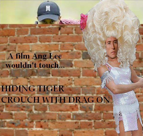
    5.  Hiding Tiger Crouch With Drag On. No, it turns out that you can’t.  You can rely on them to take the madness and add big hair and sequins to it.

    Peter Crouch dressed as Lily Savage while Tiger Woods hides behind a wall

    6.  Crouch In Drag On Ridden Tiger. Now, Ceci’s previous picture was not only brilliant, it was also a bit frustrating, as I’d already got started on this one before I discovered that she’d used drag too.  But now that we’d started coming up with the same ideas we agreed that it was time to call a halt to things, and we established a truce.

    Peter Crouch dressed as a woman, riding a tiger

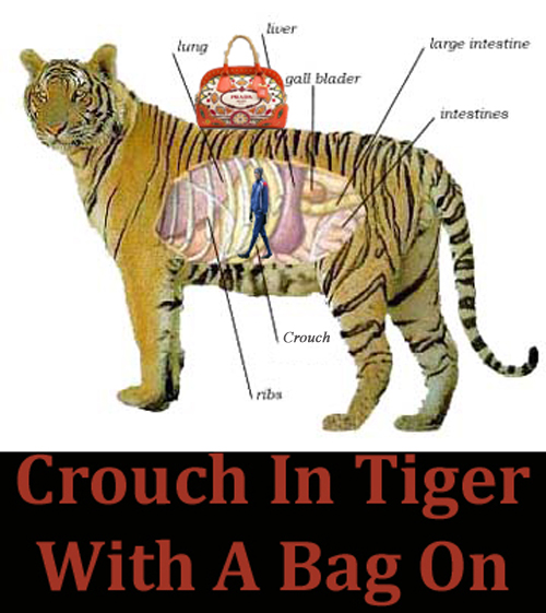
    7.  Crouch In Tiger With A Bag On. The truce lasted a full three minutes or so, until I thought of this.

    Peter Crouch inside a tiger with a Prada handbag on it

    That’s why Ceci and I should be kept well away from Photoshop but, like predatory beasts, we’ll be watching, waiting, ever-ready to pounce during the World Cup.  The moment that Crouch does anything that even remotely resembles the words tiger, dragon or hiding, one of us will strike.  Well, unless his solicitors get in touch which, on balance, seems entirely possible.