7 Reasons

Tag: pictures

  • 7 Reasons To Personalise Your Own Christmas Cards

    7 Reasons To Personalise Your Own Christmas Cards

    With just a matter of weeks to go before Christmas, why not do things differently this year? Why not get organised and avoid the mad mid-December rush? One way to avoid the inevitable queue is to use Hallmark Cards and their online personalised Christmas card service. Need convincing? Time to read on.

    7 Reasons To Personalise Your Online Christmas Cards

    1.  From Me, To You. Let’s begin with the obvious. A personalised card is just that. Unique in every way. Unless someone else also writes, “Dear Lucy, Merry Christmas, Love From Samuel. PS: I’ll try not to put your wooden leg on the fire this year!”. But let’s be honest, that’s highly unlikely. A personalised card means more. It means you have actually given it some thought. It means you haven’t just run down to the petrol station and bought the last copy of that magazine with free Christmas cards attached. That’s the true spirit of Christmas right there.

    2.  Technophobes. If your parents are from an era before technology took over the world, why not have some fun with them this Christmas? On opening a card and seeing it printed, “Dear Dad, Love From Charlotte,” your father will almost certainly ask you how your name is printed inside. You can either tell him that you went around the country in search of a card with the name Charlotte in it – which will impress him and make him feel loved no end – or you can explain that it’s an intellicard. Basically, that’s a card that uses remarkable technology to decipher the name of both sender and recipient simply by touch. And yes, an intelligence is particularly good if you’ve just bought your Dad socks. Again. He’ll ignore his present and be baffled by the card for hours.

    3.  Something For All. Finding suitable Christmas cards for different people gets harder and harder each year. Using Hallmark’s personalised service though, you can be sure that you are going to get the right card for the right person. There are traditional cards for those who celebrate Christmas as a religious festival, bright and colourful cards for those who use it as an excuse to party and an OK magazine card for the celebrity addict in the family. Who, incidentally, should be shut in a room by themselves for the day. Probably with Katie Price’s latest picture book.

    4.  Attention To Detail. This reason probably applies for the more haphazard sex, but we won’t discount women. For many people a card is the last thing they think about buying. Usually five minutes before the shops close on Christmas Eve. As a result they fly into the nearest retailer and pick up the first one they see. Then they get home and realise it says ‘sister’, ‘aunt’ or ‘my little fantasy’ instead of ‘wife’. Not good. Get online and use Hallmark’s personalised Christmas cards service. It’ll help you concentrate the mind and make sure you won’t spend most of Christmas morning trying to cover up the word ‘secretary’ with a felt tip pen.

    5.  Children. Toy manufacturers make a killing at Christmas. Not literally, obviously. As Herod demonstrated, that would be wrong. We mean they make a lot of money. Simply by making children want toys they don’t need. It’s genius. But very expensive for the parents. So this year don’t give them a present. Give them a card that’s better than a present. Thanks to Hallmark Cards your child can now star alongside Woody and Buzz on a Christmas card. Your children won’t want a present, they’ll want to know when Toy Story 4 is coming out. (It should be said this will only work with young children. By the time they’re 24 they’re fairly wise to that sort of thing).

    6.  Words and Pictures. Why is it that whenever you find a card with a half-decent design, the words inside always read, “Merry Christmas to the one I love, you keep me warm and snug on the sheepskin rug”? Similarly, you might find a verse that doesn’t make you vomit all over the card rack, but the front of the card says, “To my step-mum’s sister’s daughter’s boyfriend”. You can’t give that to your brother – unless he is your brother we suppose. It’s far better to get online, choose the design you want and write the wants you need to say.

    7.  This Is Us! You know those sickly yearly newsletters that you in get in Christmas cards from some families – the one that tells you Tarquin went Zambia on his gap year and set up a water buffalo sanctuary – well, a personalised card is perfect retribution. On many of the cards you can add a photo, and with so many photo editing packages out there it would seem rude not to show the smug ones exactly where you’ll be that Christmas. Nestled above an accompanying photo should be the words, “Merry Christmas From Sir Richard Branson’s Private Island!” That’ll shut them up. They’ll probably take you off their Christmas card list too. That’ll save a stamp.

  • 7 Reasons That Kim Jong Il Is The Ideal Pet

    7 Reasons That Kim Jong Il Is The Ideal Pet

    Hello dear reader!  At 7 Reasons, we’re not afraid to admit when we’re wrong and today, we do just that.  Once, we were of the opinion that the Komodo dragon was the ideal pet but, though that would be amazing, we’ve realised that there is a superior one.  It’s Kim Jong Il.  Here’s why.

    1.  Kim Jong Il Comes In Many Colours.  Whatever your interior colour scheme; whatever hue and shade your decor, there’s a Kim Jong Il to blend in perfectly with it.  Even if it’s beige.

    2.  Kim Jong Il Is Independent.  Don’t want a needy pet that requires you to take it out for walks or let it in and out five times per hour?  Kim Jong Il is ideal: He comes with his own man-flap.

    3.  Kim Jong Il Annoys The Neighbours.  All the best pets annoy the neighbours, whether it’s next-door’s dog barking at all hours, next-door’s cat pooing in your flower bed or next door’s snake being a snake in close proximity to you.  Kim Jong Il does this too.

    4.  Kim Jong Il Is Loved By Women.  That’s important in a pet.  After all, they’re usually the ones that end up looking after them once the children grow tired of the responsibility.  Surely there isn’t a woman alive that wouldn’t jump at the chance to care for Kim Jong Il.

    5.  Kim Jong Il Is Good With Children.  This is an important consideration when choosing a pet.  You need a pet that can help teach them social skills and engender a sense of playfulness in them.  That pet is Kim Jong Il.

    6. Kim Jong Il Makes Everyone Happy.  Everyone loves the warm, fuzzy joy of pet-ownership (it’s one of the reasons we have them).  They bring delight and wonder into our lives and spread happiness and warmth wherever they go.  So does Kim Jong Il.

    7.  Kim Jong Il Is Easy To Feed.  While other pets have special dietary requirements and often need to be fed expensive and exotic foodstuffs, Kim Jong Il prefers a simple diet of radishes.*

    So there you go.  Kim Jong Il is the ideal pet.  The only drawback is that you might occasionally have to see this.

    Seems a small price to pay.  So let’s all go out and get a Kim Jong Il.  Is a home really a home without one?


    *Or sometimes fresh lobsters that he has airlifted to his train whenever he’s away travelling.

    **For fans of looking at Kim Jong Il looking at things, this is the place to go.


  • 7 Reasons That We Shouldn’t See The Photograph

    7 Reasons That We Shouldn’t See The Photograph

    Breaking news:  The world is debating whether or not to look at a photograph, and here at 7 Reasons we have an exclusive.  We have got hold of the picture that you should never, ever see, and we’re going to let you, our thoroughly grown-up readers, decide whether you want to look at it.  The 7 Reasons team have viewed this graphic image and it’s fair to say that we were somewhat taken aback.  In fact there was gasping and a bit of vomiting.  We’re going to post a link to the picture at the bottom of this post but before you go there, let us explain why you shouldn’t look at it.

    a red censored stamp on a black background

    1.  You Don’t Need To See It.  Would your life be improved immeasurably by viewing it?  No. Quite the opposite, in fact.  If you want to look at it, it’s only because of morbid curiosity.  You don’t need to see it, and your life will not be enriched by viewing it.  Trust us on this, we’ve seen it, and once you see the picture, you cannot un-see the picture.  It’s like Pandora’s box except it’s not Pandora’s box, it’s a box belonging to someone else.  Don’t look into the box and certainly don’t zoom in on it with your mouse.  The RSPCA don’t take that sort of thing lightly.  Don’t look into the box!

    2.  It’s Gruesome.  The image is bloody horrible.  It’s truly sickening to behold and it will haunt you until your dying day.  If you don’t want to see something so abhorrent that you might try to poke your own eyes out with a spoon* don’t look at it.

    3.  There’s A ‘Hole.  A big ‘hole.  Where once there was life, now there’s a big gaping ‘hole in the foreground; something vacant.  You really don’t need to see the ‘hole.  Viewing the ‘hole is a truly hideous and traumatic experience that you can well do without.  I would have been better off without ever having seen the ‘hole.  You will be too. Don’t look at the ‘hole.

    4.  It’s Puzzling.  It really is.  Imagine you’re a Viking and a blue cat wearing jeggings is explaining string theory to you.  It’s more confusing than that.  And you don’t get to wear a beard or one of those horny hats either.**  There is nothing in the world that makes less sense than this image***

    5.  It’s Graphic.  We don’t really know the circumstances under which the photograph was taken; perhaps it was hurried, we don’t know, and frankly we don’t want to think about it any further.  But there’s still a fire visible in the background and there’s flesh.  Much flesh. It’s apparent that the scent of burning flesh would have been strong when this picture was taken.  You don’t need to see that or even think about it.  In fact, stop thinking altogether.  It only leads to trouble.  Don’t think and don’t look at the picture.

    6.  Side-Effects.  We’re reasonably young and healthy here at 7 Reasons**** and we felt unwell when we saw it.  So we wondered what this image could do to readers with any underlying health problems and, even though we’re not real doctors, we’ve come to a conclusion via a process of wild speculation and abject conjecture: This image could kill.  And dying would be inconvenient as you’ve probably got things to do this afternoon or dinner plans.   Don’t look at the picture.  And don’t die.

    7.  Trust. Now we’ve put the link to the picture just below this paragraph and we’re going to let you decide whether to look at it or not.  But, before you make that important decision, consider this.  If you look at the image, you’ll be doing it for the wrong reasons as – and we’ve made this quite clear – it’s bloody horrible and you don’t need to see it.  We hope you’ll trust that the judgement of the 7 Reasons team in this matter is sound and that we have your best interests at heart.  So when deciding whether to view it, remember that if you choose to look, you’ll be letting us down and you’ll be letting yourselves down too.  Oh, and you should probably lock away your spoons.


    Here is the link to the image, don’t click on it.


    *Or whatever else you have handy, I don’t know why I assume that all 7 Reasons readers are equipped with a spoon.

    **If we do have a Viking reader, imagine you’re a Norman.  Or a Gerald.

    ***Except for the labels in baby clothes that say “Keep away from fire”.  Where do clothes manufacturers imagine that people store babies?

    ****When the health and age of the team is taken as a mean average.


  • Russian Roulette Sunday: The Images

    Russian Roulette Sunday: The Images

    Hello!  Happy Sunday! (or Friday, if you’re one of the 7 Reasons team editing this post before scheduling it for Sunday)

    Images are very important to us here at 7 Reasons and we always try to put them together in-house because, though what we post usually isn’t about an image, there’s always at least one picture attached to what we’ve  written.  We wanted to communicate the significance that we place on arresting and original visuals to you, so we decided that today we would chose three each of our favourite images from previous posts (plus one we’d used from Google Images by way of contrast) and hold an earnest and thoughtful contemplation of the importance of imagery in our posts and the technical and aesthetic merits of the selected illustrations as pieces of artwork.  Obviously we failed, so here’s Marc Fearns and Jonathan Lee bickering about pictures instead.

    Hitler’s Hand

    Originally used in 7 Reasons That Size is Important.

    MF.  This is probably my favourite of the images I’ve put together for 7 Reasons.  It’s not technically brilliant (in fact, it’s quite flawed), but boring stuff aside, it ticks all of my boxes: It’s black and white; It has Hitler in it; it has some sort of Photoshop-induced oddity (the big hand), and it has a random, bizarre element to it (the triangle apparently embedded in Himmler’s head).  If it weren’t for Jon’s civilising influence, 7 Reasons would probably look a lot more like World War II than it does already.

    JL. I have a serious problem with this image. It seems to suggest the Nazis were very handy. The Nazis were not very handy. They weren’t even quite handy. The Nazis were rather irritating and quite frankly caused more harm than good. I also have a problem with Himmler. Unlike Marc I am not struck by the triangle in his head, but his the binoculars. Why did Himmler need binoculars? Was he a part time ornithologist? Was he a pervert? Why are they pointing at his trousers? This picture provides more questions than answers. And that I find rather frustrating.
    7 Reasons Playing With A Cuddly Toy 2010 Was Not A Let Down
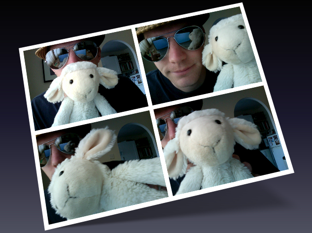
    Lamb & Jon Photoshoot

    Originally used in 7 Reasons Playing With A Cuddly Toy 2010 Was Not A Let Down.

    JL. I like this picture because I look like an idiot. And in this life there just aren’t enough people prepared to be idiots. Sure, there are idiotic people, but that’s by accident. It takes a very special kind of person to deliberately make themselves look like an idiot and I am very proud to say I am very special. It also reminds me of that great day last September with Lamb. Oh, what fun was had. Rock on.

    MF.  I’m less keen on this picture than Jon.  While it does feature a pair of Aviators, which is always a good thing, it’s lacking something quite fundamental.  Hitler.  Or the war generally.  Also, outside of the framing, there barely a straight line in it.  And what’s with the archway?  What sort of oddball has an archway in their house?  And he’s wearing a hat indoors which, as any grandparent would be very keen to point out, is a #manfail.  The only thing that makes this image good is the albino monkey.

    The Anglo-French Flag

    Originally used in 7 Reasons The Anglo-Franco Defence Agreement is a Good Idea

    MF.  This Anglo-French flag is something that I’m rather proud of. I constructed it from a picture of a British flag, a picture of a French flag and a picture of a silk sheet (which is how I got the creased fluttering effect). It wasn’t even in the post itself, it was the featured image, which means that it appears next to the post on menus as a thumbnail and it was in the Latest Posts window at the top of our home page for five days. You might wonder why I’d go to such an effort to create an image that would be barely seen but, to me anyway, that sort of detail is important, and I like to think that 7 Reasons is all the better for having high standards. That the image of the intertwined British and French flags brought Jon to near-apoplexy is purely coincidence.

    JL. As Marc indicates, this picture absolutely disgusts me. I don’t mind the United Kingdom and France joining forces if we are beating up some bad guys, but to merge the Union Jack with the Drapeau Tricolore is nothing less than treason. I have had to ask myself many searching questions since Marc posted this. Should I turn him in? Can I continue to work with him? How the hell did he get that creased fluttering effect? In the end I have allowed Marc to remain living his life in York. The prospect of writing 7 Reasons on a daily basis was just too much to deal with. Rest-assured though, he’s had a warning. A severe one. And, as he’s posted it again, I shall be poking him on facebook too.

    7 Reasons You Should Never Get Cary Grant & Carrie Grant Mixed Up
    Beauty & The Beast

    Originally used in 7 Reasons You Should Never Get Cary Grant & Carrie Grant Mixed Up.

    JL. Let me clarify one thing, I don’t have a ‘Cary Grant dressed as a woman’ fantasy. I think it’s important to remind you of this now as I can see why you may be thinking such a thing. It’s a disturbing sight. I don’t think there is any getting away from that. So why do I love it? Well that comes down to the photoshopping. Do you know how difficult it is finding a picture of Cary Grant and a picture of Carrie Grant that will go together seemlessly? No, of course you don’t. The consequences of your actions rarely lead you to such an investigation. The consequences of starting 7 Reasons very much do. So, yes, I was delighted that I found two pictures that would work together. It’s not perfect. If I had my time again I would do a bit of work on their skin tones, but for the purpose of the post it did the job. And in 7 Reasons circles that means victory.

    MF. For once, I agree with absolutely everything that Jon said about this image.  In his third sentence.  I do, however, have some observations of my own.  Firstly, bloody Twilight: When you’re a vampire and you’re not even the scariest person in the background of a picture, you’re doing it wrong and you should just bloody stop.  Secondly, there’s a terrifying bald man wearing an ill-fitting white suit and eyeliner with someone’s severed arm tucked under his own arm.  I haven’t slept properly since I saw this.  Thirdly, I find Jon’s Cary/Carrie Grant hybrid creature more attractive than the actual Carrie Grant.  Or Cary Grant.  This is troubling.  And Jon never responds to my emails begging him to photoshop more of them.

    Lungs, Heart, Asparagus.

    Originally used in 7 Reasons That We Should Grow Vegetables in our Lungs.

    MF. I put this one together to complement the title of the piece. It’s an original x-ray with the heart and lungs highlighted which I found online and added asparagus to. I’ve chosen this image not just because I’m pleased with the way it turned out, though I am rather. I’ve chosen it because of the almost boundless amusement it gives me every time someone discovers it searching Google Images for x-rays of lungs. I just like knowing that at any given moment someone, somewhere in the world is looking at it thinking, “Blimey! (or perhaps a colloquial equivalent) That looks nasty. I’m going to treat asparagus with more respect now”. I feel certain that one day, this picture will turn up in a medical journal, or on a GP’s surgery wall.

    JL. Who eats asparagus whole? Is that even possible? This is just one of the 7 Reasons images that has inspired readers all over the road. A bit like that man in Norwich who – having been so inspired by a post last June – tried to break the world record for number of Jaffa Cakes eaten in one minute and was subsequently sick all over the biscuit aisle. Now, I am not for a minute encouraging you to see how much whole asparagus you can eat at once – that would be highly irresponsible of us – but if you manage more than five I would love to know.

    7 Reasons To Kiss Properly
    Kiss Kiss, Bang Bang

    Originally used in 7 Reasons You Should Always Kiss Properly.

    JL. I know what you are thinking, ‘Typical Jon. Two of his three image choices feature him.” Yep, I can’t argue with maths. But let’s look at this photo. At least for as long a you feel comfortable doing so. It is an animated GIF! How bloody exciting! But more than that it is a reminder. A reminder of how far my kissing technique has advanced since last March and – if you’ve been using the above as some kind of guide – how far backwards yours has gone. Lovely stuff.

    MF.  “AAAAAAAAAAARRRRRRRRRRRRGGGGGGGGGGGGGGGGGHHHHHHHHH!!!!!!!!!” was my initial reaction to this image when I first saw it eleven months ago.  And now that I am older, wiser and more mature, on reviewing this image I would say that my reaction is now AAAAAAAAAAAAAAAAAAARRRRRRRRRRRGGGGGGGGGGGHHHHHHHHHHH!!!!!!!”.  Note that Jon has attempted to baffle us with maths to distract from the inherent narcissism of his selections, but let’s consider it carefully.  This, as Jon points out, is an animated GIF, so it’s not one picture of him, it’s three pictures of him.  This means that four out of Jon’s five image choices are of himself.  That’s 80%.  Anyway, that aside, I like this picture.  On the first occasion I viewed it I remembered that I was supposed to unblock the kitchen sink, and the repeat viewing has caused me to agree with my wife that I spend too long on the internet and I’ve now closed my laptop, sellotaped it shut and placed it under a sofa.  With an anvil on top.

    Raw Sausages

    Originally used in 7 Reasons That December 24th Should be Known as the Day of the Sausage.

    MF.  Aha!  I remember this piece.  Sadly, I also remember this picture.  It makes me feel sick.  It’s not just that the raw former-animal bits are shiny and greasy looking and some of them appear to be inside used condoms, it’s that I don’t even remember which of us added this to the (co-written) piece.  I realise what must have been going through the mind of the person that uploaded it.  “Sausages!  Sausages!  We’ve written a piece about sausages and now I need an image of sausages – any image of sausages – right now, to go with the piece about sausages!” And, in the grip of a deadline-panic, that person will have just grabbed the first image of sausages that they saw and attached it to the post.  Truly horrible.

    JL. This is a perfect example of what one calls, ‘shooting oneself in the foot’. Not that I shot myself, Marc shot me. And himself. And our argument. Using this image kind of reminds me of that day I sent my CV out to dozens of prospective employers and realised a week later that it didn’t contain my contact details. That section about my ‘outstanding attention to detail’ lost all credibility after that. Now, I’m not saying that the idea of the Day of the Sausage lost credibility with the inclusion of this image, just that – if such a day ever was created – Marc and I would not be part of the marketing team. And that’s sad.
  • 7 Reasons Picking Up The “For My Horny Boyfriend” Christmas Card Was A Mistake

    7 Reasons Picking Up The “For My Horny Boyfriend” Christmas Card Was A Mistake

    There are moments in our lives when we question our actions. For me, such a moment took place a few days ago. I was in a branch of a well-known national card selling establishment perusing the shelves for a suitable Christmas card to buy for my girlfriend. Being ‘in the zone’ I was unaware of my surroundings. And – in particular – the location of the boyfriend section. Being of the heterosexual kind, I prefer my woman to be a woman. And, in something of a triumph, my girlfriend is both. As a result I was not on the look out for a card addressed to a boyfriend. So when I inadvertently picked one up the other day, it was a mistake. A terrible mistake.
    7 Reasons Picking Up The "For My Horny Boyfriend" Christmas Card Was A Mistake
    This is not the actual card. I was hardly going to take a photo of the actual card was I?

    1.  Realisation. At first I felt a bit silly, but that feeling subsided very quickly once I realised exactly where I was. In a well known national card selling establishment. I froze. Were people around me? Was I being watched? Had this been captured on CCTV? What if it had? What if people had seen me browsing the girlfriend cards only to then move onto the horny boyfriend section? They’d think I was a slut!

    2.  Hesitation. Having stood, motionless, for what seemed like an eternity but in reality was probably only a few seconds, I had a another problem. Anyone who had done the same would have realised their mistake and immediately put the card back. But I had paused. A pause that could easily be mistaken for contemplation. A fatal pause. Those people who thought I was a slut, now thought I was a serial adulterer!

    3.  Frustration. So now what do I do? Do I put the card back quietly and pretend* it was not what I was looking for or do I make a bit of a song and dance about it? Do I say, rather loudly, “Oops! I didn’t want that!”? You know, just so every knows exactly where I stand on the whole horny boyfriend thing. It certainly has it’s merits, but what if I overact it? What if I sound really, really camp? What if I am not believable. Those who thought I was a slut and then changed their minds to a serial adulterer will now think I’m in denial!

    4.  Contemplation. It must have been a minute now and I am still holding the card. What am I doing? And, hang on a second, why am I reading it? Why am I reading the words, ‘A naughty Christmas poem for my horny boyfriend‘? Why? Why am I doing this? And why am I not stopping? This is a poem for my boyfriend, who is always so horny and whose body… Argh! I must stop! Those who thought I was a slut come serial adulterer come man in denial now must think I am a pervert.

    5.  Determination. I know now that there are other people around me. I have men to the left of me looking at cards for their girlfriends and I have women to the right of me looking at cards for their boyfriends. I hold my ground on the join. I can’t buckle. I can’t throw my bags on the floor and begin sobbing. Mainly because I don’t have any bags, but also because it’s so bloody cold outside that all the moisture in my eyes has frozen. I’m going to get through this though. I pull the card closer to my chest so no one can see what I have picked up. I am just going to stand here until everyone has gone. Though those that originally thought I was a slut, a serial adulterer, a denialist and a pervert, now just think I am an idiot standing in their way.

    6.  Innovation. These people aren’t leaving! They just keep looking at other cards. It’s midday now. It’ll be dark soon. I’m going to have to be clever. I am going to have to put the card back without anyone noticing. So I pick up another card – one that is addressed ‘to my girlfriend’ before you ask – and I pretend to be interested in it. It’s bloody hideous so that doesn’t take long. Then, rather cleverly, I put it back with the horny boyfriend card underneath. And no one notices. Until the guy next to me picks the girlfriend card up which of course leaves the horny boyfriend card on display. He looks at me and I look at him. He doesn’t think I’m a slut, an adulterer, a denialist, a pervert or an idiot. He thinks my girlfriend is a boy!

    7.  Affirmation. This is the point at which I realise I am in an awkward situation so I may as well make the best of it. Half the battle of a 7 Reasons writer, is to find the inspiration. Well here I was. With inspiration staring directly at me. No, not the man. He has moved on. I am staring at the card again. I am living a 7 Reasons post. All I had to do was remember exactly how I felt when I picked the card up in the first place. So I pick it up again and repeat the whole process. Now I don’t care who thinks I’m a slut, an adulterer, a denialist, a pervert, an idiot or a ladyboy fetishist, because I know I am a genius. A rosey-red cheeked genius.

    *This is what a Horny Boyfriend card can do to you. You start pretending you don’t want the card that you didn’t want in the first place.

  • 7 Reasons That The Correct Font is Important

    7 Reasons That The Correct Font is Important

    Fonts: Sometimes we don’t pay enough attention to them, but choosing the correct one is vital for your project; be it a full blown advertising campaign, a sign for your office, a Christmas card or a publicity photo. Here are seven reasons why.

    1.  Playfulness.  Kristen is a lovely, whimsical, childlike font which, when used correctly, imbues the work with a sense of playfulness and naivety.  When used incorrectly however, it is not as effective:

    Adolf Hitler poster with a swastika at Nuremberg saluting (salute) with brownshirts (painting, picture,propaganda). ITC Kristen Font

    The message Drive to the East was intended as a call to invasion and conquest.  This poster may still encourage people to drive East, but now they’ll be doing it in Smart cars whilst drinking Innocent smoothies and listening to Death Cab For Cutie.  The Kristen font is too jaunty for Hitler.

    2.  Menace.  Similarly, Fraktur is a font associated with much Nazi propaganda and many of their legal notices.  When used in this context however, it rather blurs the message:

    a cute bunny picture poster to raise funds for the animal shelter.  Fraktur font

    Even the sad face can’t rescue this one.  The font exudes menace and it makes it appear more of a threat than an appeal:  That if you don’t give them money, ranks of jack-booted stormtroopers will goose-step on poor Flopsy. :’-(  Still quite an effective message though.

    3.  Cool.  Some fonts – Sidewalk in this instance – are rather cool and edgy and, when used sparingly, can really make an impact.

    An office notice about washing up teacups using the sidewalk font

    When making a sign for the office kitchen though, they tend to work less well.  The thoughts of the users of the office kitchen will probably range from, “What in god’s name is that abomination on the wall?!”  to, “Wow!  Emma’s like the coolest person ever to have put up a sniffy notice about washing teacups.  Ever.”

    4. Minimalism.  The moon: A cold, empty, stark place which requires an appropriately minimal font and, when putting together an article on whether man will return to the moon, it’s important to use one.  And not this:

    A picture of the moon and speculation on man's return to it.

    French Script really isn’t doing this picture any favours.  It’s over-elaborate, cluttered, and just not spacey enough.  And it’s French.  They’ve never been to the moon.  They rarely go as far as Sussex.

    5.  Seasonality.  Christmas: Evocative of roaring fires, presents, carol singing, peace, goodwill and happy families spending quality time together at home.

    A Victorian Christmas scene bearing the legend, "Merry Christmas To One And All".  Digital Readout Thick Upright font

    But when your Christmas card features the Digital Readout Thick Upright font, you introduce the spectre of The Terminator into the traditional family Christmas, and that doesn’t seem like it will go well.  Even if he does bring presents from the future.

    6.  Clarity.  Clean crisp fonts such as Gill Sans exude class.  With a plain, unfussy font your carefully chosen words are showcased to their best advantage.  The BBC use Gill Sans, and the famous Volkswagen Lemon advert used a similar font.  Sometimes though, it’s not a good idea to go minimal:

    An extraordinary comment on a Youtube video using a Gill Sans font.

    Because the reader’s attention is drawn to every error and mad utterance in your crazed internet rant.  And yes, I did cut and paste this from a comment on one of our posts.  Answers on a postcard?

    7.  Gasp! There’s a lot of snobbery around the use of MS Comic Sans.  And many perfectly reasonable people say that it should never, ever be used; there are websites and Facebook groups that campaign against it.  But they’re wrong.  Because I’ve found a use for it:

    A black and white (B & W) publicity picture (portrait) of Jonathan Lee. (7 Reasons/7reasons.org).  MS Comic Sans font

    You can use it to take perfectly good, artfully shot publicity photos, and make them funnier.  I’m so happy with this one that I’m not even going to charge for it.  Finally, a use for Comic Sans.

  • Guest(ish) Post: 7 Reasons We Should Be Kept Well Away From Photoshop

    Guest(ish) Post: 7 Reasons We Should Be Kept Well Away From Photoshop

    Today’s guest(ish) post comes to you courtesy of Marc Fearns, who can usually be found doing stuff here, and the amazing Ceci Masters of Swanning About fame; a blog so good that it’s in The Times’ list of the top 50 cricket blogs, along with the blog of another friend of 7 Reasons, Sarah Ansell, and forty-eight other blogs that we’re less interested in.

    This guest(ish) post is a little unusual.  It tells the tale of last Friday evening when, shamefully, Ceci and I were both at our homes, with our Photoshop software open.

    1.  Crouching Crouch Hidden Dragon. It started innocently enough.  Ceci – inspired by the film Crouching Tiger Hidden Dragon – produced this picture for the Facebook group, Hollywoodgate: Onde futebol e película cruzam.  She also put it on Twitter.

    Crouching Crouch Hidden Dragon, a picture of Peter Crouch playing golf with a dragon behind him, courtesy of Ceci Masters.

    2.  Hiding Crouch Tiger-Dragon. And Twitter is where I saw it, while I was in the middle of photoshopping something else  (a cat in a submarine, I think).  Anyway, I was struck by the wordplay potential so within five minutes, this was winging its way to Ceci.

    Hiding Crouch Tiger Dragon: A picture of Peter Crouch covering his eyes to hide from a tiger-dragon

    3.  Crouch’s Tiger Hiddink’s Dragon. Then, about five minutes after the previous picture, Ceci put this one up.  There was only one way that this was going to go.

    Crouch's Tiger Hiddink's Dragon: a picture of Peter Crouch's tiger and Gus Hiddink's dragon.  Obvious, really

    4.  Grouchy Tiger Smitten Crouch. We had become embroiled in a duel.  A frenzied maelstrom of a contest in which PCs were pistols and Crouch crouching crouchy tigery tiger tiger-dragons were our ammunition.  In short, we had lost the plot.  I made this one.  But girls are sensible, and you can always rely on them to stop the madness, can’t you?

    Grouchy Tiger Smitten Crouch: Peter Crouch looking fondly at a grumpy tiger.

    5.  Hiding Tiger Crouch With Drag On. No, it turns out that you can’t.  You can rely on them to take the madness and add big hair and sequins to it.

    Peter Crouch dressed as Lily Savage while Tiger Woods hides behind a wall

    6.  Crouch In Drag On Ridden Tiger. Now, Ceci’s previous picture was not only brilliant, it was also a bit frustrating, as I’d already got started on this one before I discovered that she’d used drag too.  But now that we’d started coming up with the same ideas we agreed that it was time to call a halt to things, and we established a truce.

    Peter Crouch dressed as a woman, riding a tiger

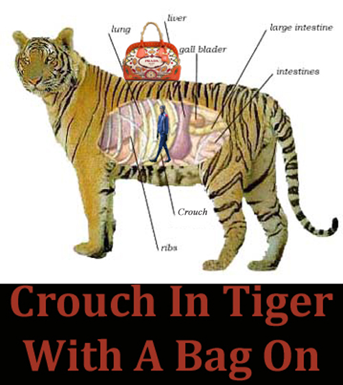
    7.  Crouch In Tiger With A Bag On. The truce lasted a full three minutes or so, until I thought of this.

    Peter Crouch inside a tiger with a Prada handbag on it

    That’s why Ceci and I should be kept well away from Photoshop but, like predatory beasts, we’ll be watching, waiting, ever-ready to pounce during the World Cup.  The moment that Crouch does anything that even remotely resembles the words tiger, dragon or hiding, one of us will strike.  Well, unless his solicitors get in touch which, on balance, seems entirely possible.

  • 7 Reasons We Love Propaganda Posters

    7 Reasons We Love Propaganda Posters

    At 7 Reasons, we’re quite into war and propaganda, and recently, we’ve been putting together some bits and pieces that we’ve used propaganda posters in.  We’ve looked at an awful lot of them in the past couple of weeks, and we were astounded at the amount of brilliant posters that we’d never seen before.  We thought we’d show you some of the more obscure ones today.  We’re sure you’ll agree that each one of them is a reason to love propaganda posters.

    A red heart containing the word "propaganda" written in a black, Soviet style font.

    1.  Tell Her Nothing (1940).  Produced quite early into World War II, this extremely rare British poster proved so popular that as soon as the posters were put up, they would disappear – presumably stolen by amorous servicemen.  This woman was a more popular pin-up than Vera Lynn in the early war years.  We would tell her everything.  And give her the blueprints (whatever blueprints are).

    British WWII propaganda poster, with a buxom woman in her underwear and the words "tell her nothing she might be an agent"

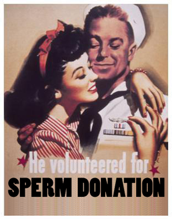
    2.  He Volunteered For Sperm Donation (c. 1945).  Used by the Americans after the end of World War II, this poster encouraged virile men to donate their little swimmers to the wives and partners of soldiers killed in action. It was believed that a baby boom would help the economy recover.

    US WWII propaganda poster featuring a sailor embracing an attractive young woman. WW2, World War II, World War 2, second world war,2nd world war

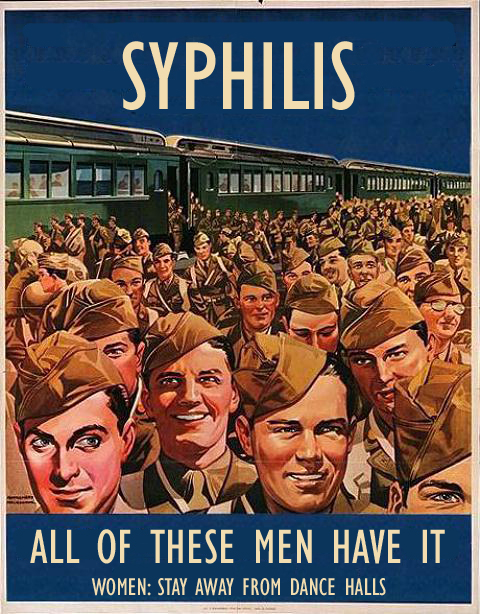
    3.  Syphilis (c. 1944).  A poster used mainly in the Dorset area during the build-up to D-Day.  It was used to highlight the dangers of fraternising with the allies.

    A World War Two propaganda poster illustrating the dangers of fraternising with American GIs.  WWII WW2

    4.  Who Smells Of Fish? (c. 1916).  In World War I, rationing meant that some foods such as fish were only able to be eaten on Friday. Many citizens ignored this order though and ate their fish on a Thursday. This campaign was created to scare those who cheated by implying that if you ate fish early you would smell.

    A World War I (WWI, WW1 World War One) propaganda poster, warning of the dangers of eating fish on the wrong day

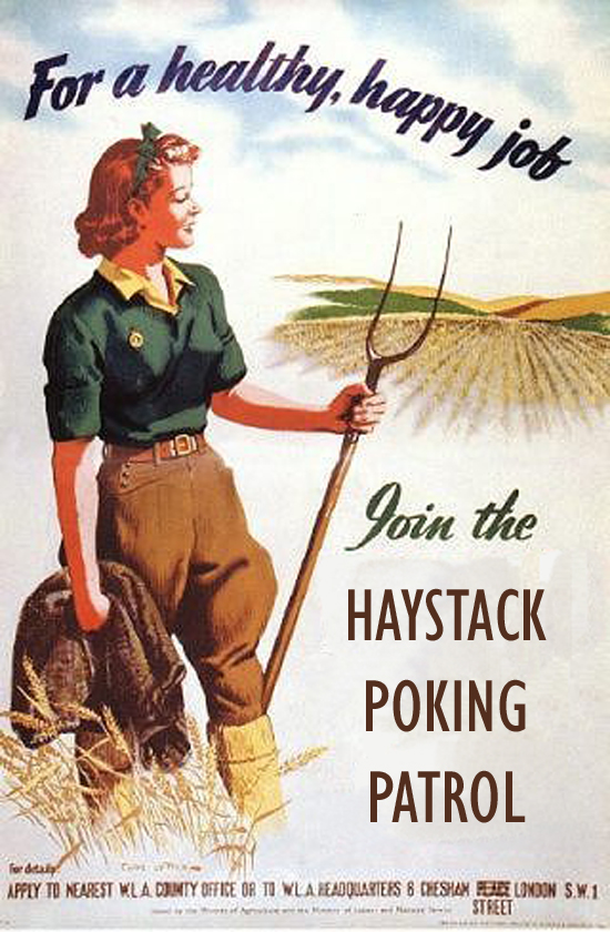
    5.  For A Happy, Healthy Job…(c. 1940).  While the Battle of Britain was raging in the South-East of England, these posters were everywhere.  Women were encouraged to organise themselves and head out into the countryside to search for German airmen that had been shot down and gone into hiding.

    A WWII (WW 2, world war two)propaganda poster inviting women to join the Haystack Poking Patrol

    6.  Women Of Britain. Direct Our Planes! (c. 1943).  Due to the sun, it was hard for Allied pilots to focus on incoming German Bombers and Messerschmitts. The British devised a simple solution. They asked women to go out into the streets and point in the direction of the bastards. Our brave boys were able to look down and follow the direction of where the women were pointing. This simple but effective solution proved vital in winning the Battle of Britain.

    A WWII (WW2 World War Two World War II World War 2) British Propaganda poster designed to encourage women to direct British air craft

    7.  Tell No One (1939).  In the early days of WWII, during the phoney war, it was easy to become overwhelmed by the media’s portrayal of the enemy.  This poster was issued by the Ministry of Health, to instruct British men on how best to deal with any psychological issues resulting from the constant media bombardment of war-stories.

    A British WWII WW2 World War Two II 2 propaganda poster instructing British men on how to deal with an imaginary Hitler in their car

    ********************UPDATE********************

    Due to the popularity of this post, we have made this series of propaganda posters available for sale in postcard form in the 7 Reasons Emporium.  There are also t-shirts.