7 Reasons

Tag: font

  • 7 Reasons That The Interrobang Is Amazing

    7 Reasons That The Interrobang Is Amazing

    Hello!  How are you?!  Excellent, glad to hear it.  Well here at 7 Reasons, we’re uncommonly excited because yesterday, @davidofyork tweeted a link to an obscure piece of punctuation called the interrobang, which has apparently been around since 1962.  It’s used to convey excitement or disbelief in the form of a question.  Here are seven reasons that it’s amazing.

    1.  It Looks Amazing!  Look at it!  Look at it!  It’s up there!  It’s a question!  It’s an exclamation!  It’s a quesclamation!  It’s an exclamastion!  It’s two different things fused together in a perfect visual synergy.  You may never have seen an interrobang before but if you’ve ever seen a question mark and an exclamation mark a casual glance at it will instantly convey its meaning.  It’s bloody perfect.

    2.  It’s Called An Interrobang!  An interrobang!  Have you ever heard a better portmanteau word?  No, I thought not.  It’s amazing.  It takes the interro from interrogate and the bang from bang!   There is surely only one better word in the world, and that word is hereisabowloftiramisuthesizeofscotlandhelpyourself which isn’t even a real word.  Interrobang is real.  Interrobang!

    3.  You Can Make One Yourself!  The interrobang is the most amazing thing that I have ever seen, you’re doubtless thinking, I want to use one as soon as possible, the very moment that I have finished reading this piece, shared it on Facebook and Twitter and pressed the Google +1 button at the bottom of the page.  But wait!  Where’s the interrobang on my keyboard?  The evil bastards at Microsoft/Apple haven’t provided one!  Where’s my interrobang?!  Well, it’s there, just before this sentence, because you don’t need a dedicated interrobang key to have an interrobang, the mere act of using the symbols one after the other is, in itself, an interrobang.  Allow me to demonstrate:

    4.  It’s Easy To Use!  How do I use an interrobang?!  Like that!  Can I use it this way round as well!?  Yes!  It’s that simple.

    5.  It’s Fun To Use!  I’ll let you into a secret.  I bloody love writing.  I find the act of forming thoughts into words and sentences then punctuating them and playing with them until they convey what I wanted to say in a pleasing way an absolute joy.  But then I discovered the interrobang, and do you know what?!  Writing became a hundred times more fun.  Because now I get to write words and when the time comes to punctuate them I get to use the interrobang!  And better than that, I am now able to use the word interrobang!  A lot!  Interrobang!  It’s amazing!  I’m literally bouncing around with excitement because of the interrobang!  Every time I use an interrobang or use the word interrobang it’s a thrill, though I do promise never to drink this much coffee before writing a 7 Reasons post again.  But only if I can say interrobang again.  Interrobang!

    6.  It Makes You Cool!  Some things are intrinsically cool.  Knowing what an umlaut is, is cool.  Steve McQueen in Bullitt, is cool.  But now you’re cooler than that, because knowing what an umlaut is, is nowhere near as cool as knowing what an interrobang is, because the interrobang is just about the most awesome thing in the world!  And it’s still quite obscure.  And now, when you watch Bullitt, there’ll be a nagging thought in the back of your mind:  Well, you’re pretty cool, Steve McQueen, but you don’t know what an interrobang is and I do!  You’re now cooler than Steve McQueen because of the interrobang!  How cool is the interrobang?!

    7.  Interrobang?!  Interrobang!  Interrobang?!  Interrobang!  Look at the interrobang!  Look at the word interrobang!  It’s there at the start of this paragraph having a conversation with itself!  It’s that awesome!  It’s the interrobang!  It talks to itself!  There it is!  IT’S THE INTERROBANG!  I’m going to go for a lie down now but not before I say interrobang!  Interrobang!


  • 7 Reasons That The Correct Font is Important

    7 Reasons That The Correct Font is Important

    Fonts: Sometimes we don’t pay enough attention to them, but choosing the correct one is vital for your project; be it a full blown advertising campaign, a sign for your office, a Christmas card or a publicity photo. Here are seven reasons why.

    1.  Playfulness.  Kristen is a lovely, whimsical, childlike font which, when used correctly, imbues the work with a sense of playfulness and naivety.  When used incorrectly however, it is not as effective:

    Adolf Hitler poster with a swastika at Nuremberg saluting (salute) with brownshirts (painting, picture,propaganda). ITC Kristen Font

    The message Drive to the East was intended as a call to invasion and conquest.  This poster may still encourage people to drive East, but now they’ll be doing it in Smart cars whilst drinking Innocent smoothies and listening to Death Cab For Cutie.  The Kristen font is too jaunty for Hitler.

    2.  Menace.  Similarly, Fraktur is a font associated with much Nazi propaganda and many of their legal notices.  When used in this context however, it rather blurs the message:

    a cute bunny picture poster to raise funds for the animal shelter.  Fraktur font

    Even the sad face can’t rescue this one.  The font exudes menace and it makes it appear more of a threat than an appeal:  That if you don’t give them money, ranks of jack-booted stormtroopers will goose-step on poor Flopsy. :’-(  Still quite an effective message though.

    3.  Cool.  Some fonts – Sidewalk in this instance – are rather cool and edgy and, when used sparingly, can really make an impact.

    An office notice about washing up teacups using the sidewalk font

    When making a sign for the office kitchen though, they tend to work less well.  The thoughts of the users of the office kitchen will probably range from, “What in god’s name is that abomination on the wall?!”  to, “Wow!  Emma’s like the coolest person ever to have put up a sniffy notice about washing teacups.  Ever.”

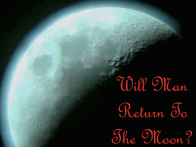
    4. Minimalism.  The moon: A cold, empty, stark place which requires an appropriately minimal font and, when putting together an article on whether man will return to the moon, it’s important to use one.  And not this:

    A picture of the moon and speculation on man's return to it.

    French Script really isn’t doing this picture any favours.  It’s over-elaborate, cluttered, and just not spacey enough.  And it’s French.  They’ve never been to the moon.  They rarely go as far as Sussex.

    5.  Seasonality.  Christmas: Evocative of roaring fires, presents, carol singing, peace, goodwill and happy families spending quality time together at home.

    A Victorian Christmas scene bearing the legend, "Merry Christmas To One And All".  Digital Readout Thick Upright font

    But when your Christmas card features the Digital Readout Thick Upright font, you introduce the spectre of The Terminator into the traditional family Christmas, and that doesn’t seem like it will go well.  Even if he does bring presents from the future.

    6.  Clarity.  Clean crisp fonts such as Gill Sans exude class.  With a plain, unfussy font your carefully chosen words are showcased to their best advantage.  The BBC use Gill Sans, and the famous Volkswagen Lemon advert used a similar font.  Sometimes though, it’s not a good idea to go minimal:

    An extraordinary comment on a Youtube video using a Gill Sans font.

    Because the reader’s attention is drawn to every error and mad utterance in your crazed internet rant.  And yes, I did cut and paste this from a comment on one of our posts.  Answers on a postcard?

    7.  Gasp! There’s a lot of snobbery around the use of MS Comic Sans.  And many perfectly reasonable people say that it should never, ever be used; there are websites and Facebook groups that campaign against it.  But they’re wrong.  Because I’ve found a use for it:

    A black and white (B & W) publicity picture (portrait) of Jonathan Lee. (7 Reasons/7reasons.org).  MS Comic Sans font

    You can use it to take perfectly good, artfully shot publicity photos, and make them funnier.  I’m so happy with this one that I’m not even going to charge for it.  Finally, a use for Comic Sans.

  • 7 Reasons That This Is Not A Circular

    7 Reasons That This Is Not A Circular

    A buff envelope has arrived.  It bears the legend, “THIS IS NOT A CIRCULAR”.  But I already know that.  I can tell.

    An envelope which states on the front that "This Is Not A Circular"
    I made this in Photoshop to protect confidential information and to prevent the internet from stealing my soul. (I am referring to the envelope. I did not construct Milton Keynes in Photoshop)

    1.  It Has A Puzzling Series Of Numbers And Letters Above My Name. No one receives circulars with baffling and impenetrable sets of numbers on them – unless they subscribe to a sudoko magazine – so it’s definitely not a circular.  The reference numbers and letters are a puzzle in themselves though:  Why are there so many of them?  Does this organisation really need a forty-six character indexing system?  Is it merely coincidence that my waist size and the amount of times I’ve eaten trifle in the past six months are contained within the numbers?  Is this what happened to Dan Brown?

    2.  It’s From Rhyll. Circulars tend to be fun, exciting things that you’ve subscribed to, and are happy to receive.  They don’t come from Ryhll: Home of nothing fun and exciting (It’s the town motto).

    3.  It Says “PRIVATE AND CONFIDENTIAL” On It. It doesn’t just say “private and confidential”; it shouts it with great portent, in a bold, roman font in capital letters.  This is presumably to instil terror into the heart of any ne’er do well that may be thinking of breaking into the letter.  It commands non-addressees not to open it.  The contents couldn’t be safer if they digitally encoded them and gave them to MI5.  Really, they couldn’t.

    4.  I Can See That It’s Not A Circular.  It’s got four corners.  It’s a rectangular.

    5.  Because My Name Is Spelled Correctly. It’s an easy giveaway.  No circular – The Chap magazine, the Isle of Wight Donkey Sanctuary newsletter, Tiramisu Consumers Monthly, the Rohan catalogue (as soon as I finish writing this, I’m going to subscribe to more interesting things, I promise) – ever spells my name correctly.  It’s the law.  Some of them (I’m thinking of you, Font Magazine) manage to spell both of my names incorrectly – and my address – though it is done very neatly and tastefully.

    6.  It’s In A Buff Envelope. No fun personal correspondence comes in a buff envelope.  None.  In fact, nothing exciting comes in a buff envelope.  White envelopes, yes.  Yellow envelopes, yes.  Purple envelopes, yes…every colour other than buff, which isn’t even a colour, except on envelopes.  Has anyone ever painted their house buff?  No, they haven’t.  That would be silly.  And dull.

    7. Because I Don’t Want To Open It. I feel an instinctive aversion to opening the envelope.  It looks like it contains something really boring.  This never happens with circulars, except the Toolstation catalogue (white envelope), which always reminds me that I should be hammering and banging at something, and that I don’t own enough power-tools (to build a nuclear submarine).  If you want me to open the envelope print, “THIS IS A CIRCULAR” on it, or add a picture of a happy dog to the front.  That may fool me.  Then I won’t ignore it while I write about it before heading off to do something more interesting than reading it.  Visiting a quilt museum, for example.