I wouldn’t blame you if the subject for today’s post has passed you by. The only reason it didn’t pass me by is because I spend a great deal of my life browsing the world wide web for inspiration. Unfortunately I stumbled across this. Dundee is getting it’s very own V&A Museum. Yesterday, the winning design was chosen. Given the design of the Scottish Parliament Building, I suppose I shouldn’t have been surprised that it was ugly. Curious as to what this abomination had been chosen over, I took a look at the shortlist. And then I realised I felt very sorry for Dundee indeed. Well, the whole of Scotland actually. Here is that shortlist:
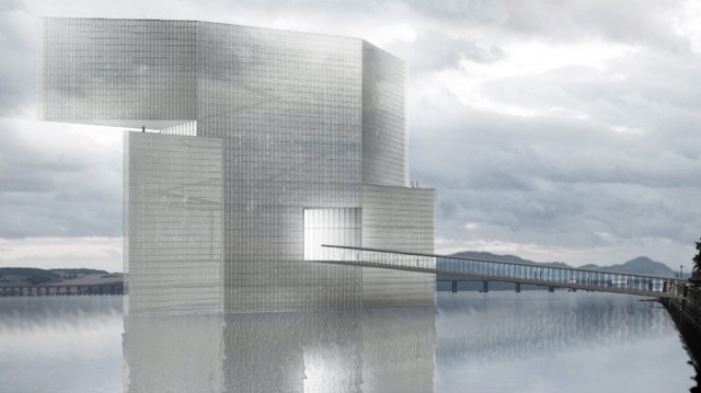
1. The Stephen Holl Design. One of the first things you should notice about this is that you access the museum via one of those bridges you usually find spanning motorways should you wish to get from one service station to another. While this is a nice touch, I can’t be so complimentary about the rest of the design. It’s very tall, very thin and appears to be doing a bad impression of ‘the robot’. In other words, it’s a bit like Peter Crouch.
2. The Sutherland Hussey Design. What we have here is a box. With a few bits cut out. I used to have a Micro Machines military base that looked very similar. Only that was cool. To give the Architects some credit though, they have realised the error of their ways. That’s why they added a picture of a small boy trying to jump over the wall. I’d probably join him if I was confronted by this.
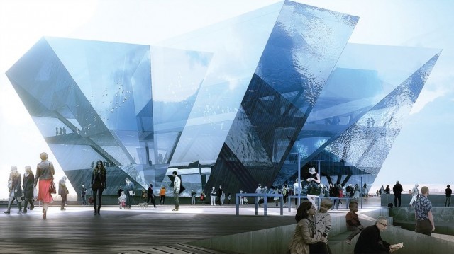
3. The REX Design. The last time I saw something like this, I was watching Superman. Only Superman wasn’t in Dundee, he was on Krypton. The effect, I suspect, would have been very similar though. What I particularly love about this design though, is that it clearly doesn’t have a roof. That’s why it’s filled with water. Genius.
4. The Snohetta with Gareth Hoskins Architects Design. I can’t comment on other angles, but from the one we are given above, all I can see is a submarine with a large whale not doing a very good job of hiding behind it. The submarine is also a bit too bling for me. I suspect it will blind more visitors than satisfy them. On the plus side, nice use of the skateboard ramp on the walkway.
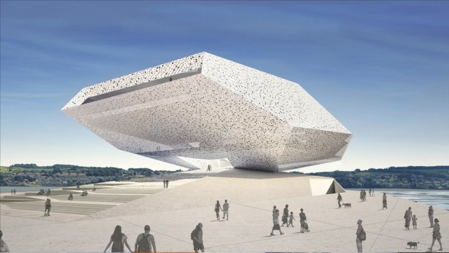
5. The Delugan Meissl Design. If you are not thinking, ‘Sydney Opera House meets Pyramids meets Lord’s Cricket Ground Media Centre meets Alien Aircraft’ then there is something a bit wrong with one of us. And I am pretty sure it’s not me. Ignoring the design for a second, there is also something unreal about the architects impression. Bright blue sky. It just doesn’t happen in Dundee. As the other images on this page will confirm.
6. The Kengo Kuma Design. Before we go any further, let me tell you right now that this design won. That’s right, the Dundee V&A Museum is going to look like an image that hasn’t quite quite loaded properly. That, though, is just about the only criticism I have. Everything else (i.e.: the water, the sky and lack of people with dogs) I love. Good job.
7. The 7 Reasons Design. This didn’t make the shortlist, but I still see it as an improvement on all of the above. We’ve gone for ‘minimillistic with a casual twist’. The casual twist is the upside down brick. I can’t see any problems with this design, except maybe the fact that the building sits on the water and we haven’t provided a walkway for visitors. This might just encourage people to visit the proper V&A Museum in London though. So it’s win-win.


Leave a Reply