The 1960s: clothes, interiors, fabrics, art – just about everything – were a riot of colour. This wasn’t much help to the (predominantly British) manufacturers of brown dyes and paints though, which was problematic, as during that decade their production continued apace. The result was, that by the 1970s, Britain had a huge surplus of brown colourants and needed to find a market for them to help with the balance of payments. This led to the formation – in 1971 – of the Brown Marketing Board, a government funded organisation devoted to the task of promoting the use of the colour brown by manufacturers and consumers alike.
While researching 1970s advertising, we came across many fine pieces of work by the Brown Marketing Board and today, we thought we’d share a few of them with you.
1. Swatch. A very simple poster, placed on the London Underground, on bus shelters and other street-level sites where people congregated. It was purely placed there as a brown colour swatch, the idea being that anyone standing near it would appear uncoordinated if they weren’t dressed in brown. Sales of brown coats to London commuters soared, thus proving that the simplest ideas are often the best.
2. Germans Eat White Chocolate. By the 1970s, Britons had still not gotten over the war, as this poster designed to promote the consumption of brown chocolate demonstrates.
3. If Only The Carpets And Curtains Matched. A poster used to encourage the use of brown in all areas of interior design. Looking back at pictures from the 70s, it seems that this campaign must have been a success.
4. Brown Bears Don’t Kill Seals. We’re fairly certain that they weren’t encouraging people to divest themselves of their pet polar bears in favour of brown bears. We think that this was probably just an attempt to promote brown as having generally “good” qualities. Sales of Fox’s Glacier Mints plummeted as a result of this controversial image though, and it was soon withdrawn.
5. Arrive In Style. What can we say? It’s a brown Austin Allegro. Perhaps this image contains a powerful subliminal message, because British Leyland sold loads of them. No one knows how. Maybe it was this advert.
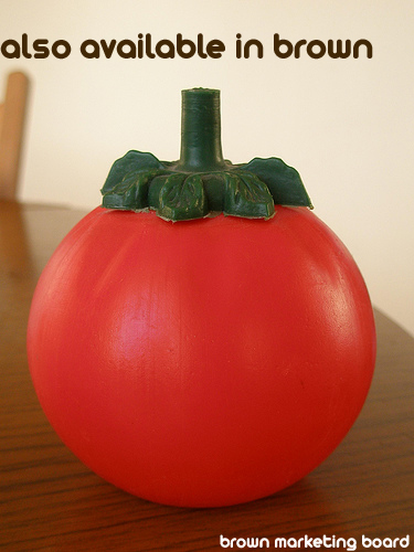
6. Also Available In Brown. A very clever poster designed to increase the consumption of domestic produce in two ways. Firstly, using brown sauce instead of ketchup would help the sales of brown food dye. Secondly, it reminds us that brown sauce is a British tradition – after all, the H.P. in H.P. Sauce stands for Houses of Parliament – so the increased use of brown sauce would directly benefit British manufacturing interests.
7. Score In Style. Well, you wouldn’t want to win ugly, would you?


Leave a Reply